


 idecoroom@gmail.com
Plan a coffee shop wall mural by matching the image to the brand mood, the customer path, and the wall that will carry the design. A cafe mural has to work harder than a simple home feature wall: it may sit behind a counter, beside seating, near menu boards, or in a photo-friendly corner. The best choice is the one that supports the room without making service areas, signage, or customer movement feel crowded.
This guide is for cafe owners, designers, and small commercial buyers comparing wall mural directions. The collection links are category examples only. They help you compare custom, 3D, nature, and tropical directions, but they do not prove product-specific material, surface behavior, maintenance, code, or installation results. Check the individual product page and the current application guide before ordering.
Start with the brand mood customers should notice first
Before choosing a mural subject, describe the coffee shop in plain language. It might be quiet and botanical, bright and playful, minimalist and architectural, beachy and relaxed, or dramatic enough for a social-photo wall. That mood should be visible from the main entrance or the seating zone where people spend the most time.
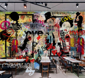
Do not begin with the loudest image in the catalog. A large mural can define the memory of the space, so the subject should support the menu, lighting, furniture, and service style. If the shop uses warm wood, plants, and soft seating, a forest or botanical direction may feel more coherent than a high-contrast city illusion. If the shop uses sharp lines and modern lighting, a controlled 3D or custom graphic approach may fit better.
Map the wall zone before choosing the mural
Different cafe walls have different jobs. The entrance wall needs quick recognition. The counter wall has to work around ordering, menu boards, equipment, and staff movement. Seating walls can carry more atmosphere because customers look at them longer. A small side wall can become a photo spot if the crop is clean and people can stand far enough away to frame the image.
| Wall zone | Best planning question | Common mistake to avoid |
|---|---|---|
| Entrance or waiting area | What should a first-time customer understand in the first few seconds? | Choosing tiny detail that cannot be read from the door. |
| Counter or pickup wall | Will the mural compete with menu boards, shelves, equipment, or queue flow? | Placing the strongest image detail behind objects that will stay on the wall. |
| Seating wall | Does the design feel comfortable at table distance and from across the room? | Using a color level that overwhelms the seating area under everyday lighting. |
| Photo wall or quiet corner | Can customers stand far enough back for the image and people to fit together? | Choosing a centered subject that will be covered by chairs, plants, or fixtures. |
Choose image scale around seating, signs, and service objects
Measure the wall after listing everything that will stay in front of it: tables, benches, menu boards, lamps, shelving, electrical points, plants, artwork, handoff shelves, and equipment. The useful mural area is the part customers can actually see. If the design depends on one centered subject, make sure that subject will not land behind a tall chair, counter edge, refrigerator, or sign.
Viewing distance matters. A narrow cafe may need larger shapes and calmer backgrounds because customers are close to the wall. A deeper seating area can carry more scenic detail. If people will mostly see the mural while moving through a queue, choose a composition that reads quickly. If they will sit beside it for thirty minutes, make sure the color and contrast do not feel visually tiring.
Use custom mural planning when brand fit or crop matters
A custom path makes sense when the wall dimensions, image crop, color relationship, or subject placement is central to the concept. Browse custom wall murals when the mural needs a particular scale, brand-adjacent mood, or wall-specific crop. Start with exact wall width and height, then mark the areas that signs, furniture, or fixtures will cover.
Keep the claim boundary clear. A custom collection is a planning path, not a promise that every image request, service condition, file type, or product property is available. If you plan to use a logo, outside artwork, or a customer-supplied photo, confirm that the image can be used and cropped before treating it as part of the wall plan.
Compare design directions with the right question
Use category pages to compare visual direction, not product-performance claims. If the cafe needs depth, doorway effects, arches, or stronger perspective, compare 3D wall murals. Check the main viewing angle carefully, because a perspective mural can lose impact if the room only shows it from the side.
If the shop should feel calmer, greener, or more organic, browse forest, nature and flower wall murals for botanical and scenic directions. If the menu, lighting, or neighborhood has a coastal or vacation tone, beach and tropical wall murals can help define that mood. In both cases, the collection supports a design category only; the product page still owns product-specific details.
Plan color so the room still sells coffee
A mural should not make the menu, pastry case, product display, or customer path harder to read. Deep colors can create a memorable backdrop, but they may darken a compact room if the lighting is already low. Pale scenic images can make a small seating area feel more open, but they may need enough contrast to stand apart from white walls and light furniture.
Bring the mural colors back to practical elements: chair fabric, wood tone, counter finish, ceiling color, plants, and menu-board contrast. If the room already has patterned tile or strong furniture, choose a mural with more open space. If the room is quiet, a mural can carry more of the visual identity.
Check operational constraints without making unsupported claims
Busy public rooms create more practical questions than private rooms. Ask where people lean, where chairs touch the wall, where staff move trays, and where cleaning or maintenance routines happen. Those are reasons to inspect the exact product details and installation requirements, not reasons to assume any general commercial rating or special surface property.
The current wall mural application guide says the wall should be dust-free, smooth, and dry before application, and it describes using a card to smooth bubbles. Treat those points as preparation checks. This article does not claim every cafe surface is suitable, and it does not replace local code, lease, contractor, or product-specific review.
Use the broader buying guide for final checks
If you are still weighing room fit, measurements, subject scale, custom crop, and installation readiness together, use the wall mural buying guide before ordering. The coffee shop decision adds customer-flow and brand questions, but the base wall-measurement process still matters.
Coffee shop mural planning checklist
- The brand mood is described before the design category is chosen.
- The wall zone is selected: entrance, counter, seating, photo wall, or quiet corner.
- Furniture, menu boards, shelves, lights, and fixtures are marked on the wall plan.
- The image scale works from the main customer viewing distance.
- Collection pages are used as design examples, not as product-property claims.
- The product page and application guide are checked before purchase.


 English
 French
 German
 Spanish